Women's Health App
Research-led design for an underserved and sensitive user group
00

problem
Women managing PCOS had no dedicated tool built for their biology. Generic fitness and wellness apps ignored their specific hormonal, dietary, and emotional needs — leaving a chronically underserved user group without reliable support.
solution
A subscription health app covering meal plans, PCOS-specific workouts, educational content, and community — built on validated wireframes with a unified visual language, trust-led onboarding, and a structured colour system across five sections.
The Brief
Cysterhood is a health app for women with PCOS, founded by a dietitian and personal trainer who both live with the condition. Research and wireframes across five sections — Plan, Recipes, Workouts, Learn, Community — were complete when I joined. My scope: visual language, interaction design, and onboarding from scratch.
The Design Challenge
Two problems ran in parallel.
The users — women managing a chronic hormonal condition who'd already failed with generic fitness apps. The design needed to feel trustworthy and specific from the first screen, not like another wellness app making empty promises.
The brief — five accent colours with an expectation all five would appear in the UI. Five colours without a usage hierarchy produces visual noise. The opposite of what this product needed.
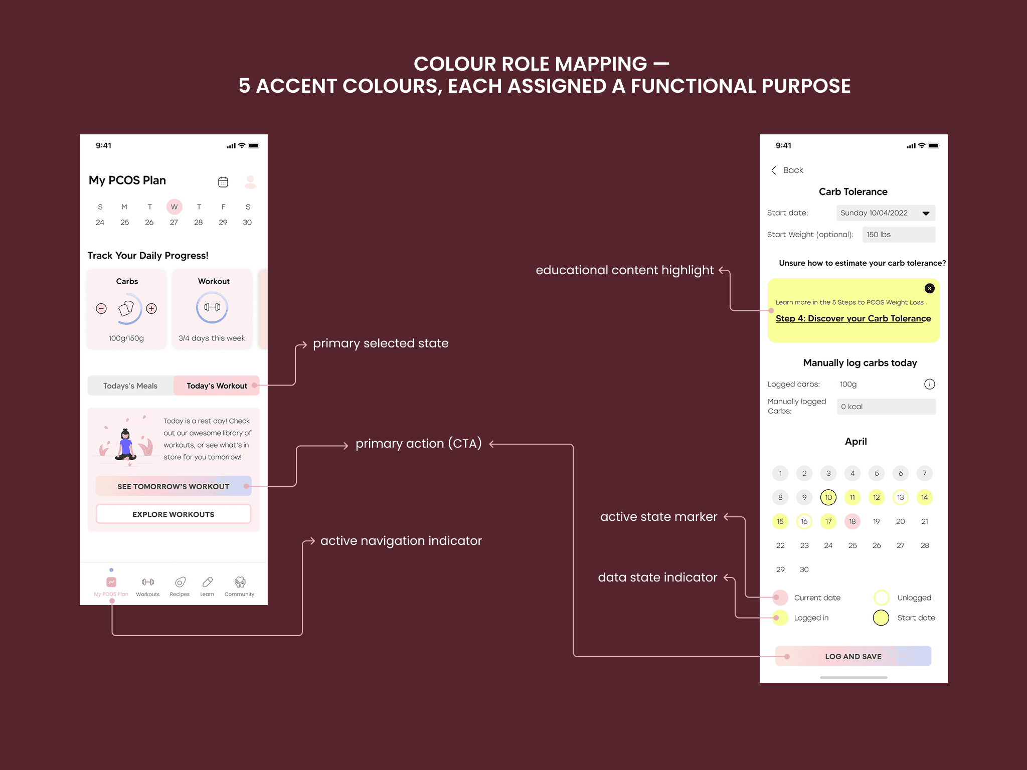
Four of five colours assigned functional roles; the fifth removed by agreement — intentional over saturated.
.year
2022
.timeframe
3-4 weeks
.role
UI/UX Designer — visual design, interaction design, and onboarding
.team
1 UX Designer (research & wireframes), 1 UI/UX Designer (me), 2 founders
.tools
Figma
.category
Consumer App
Process
Before touching screens, I presented the founders with 3–4 style variations. Rather than approving a single direction, this let them identify what resonated across options. The final visual language came from their specific feedback — significantly less rework downstream.
For the colour system, I assigned each colour a functional role. Four found clear homes. The fifth had no natural place without creating conflict — I made the deliberate call to drop it, presented the rationale, and the client agreed.
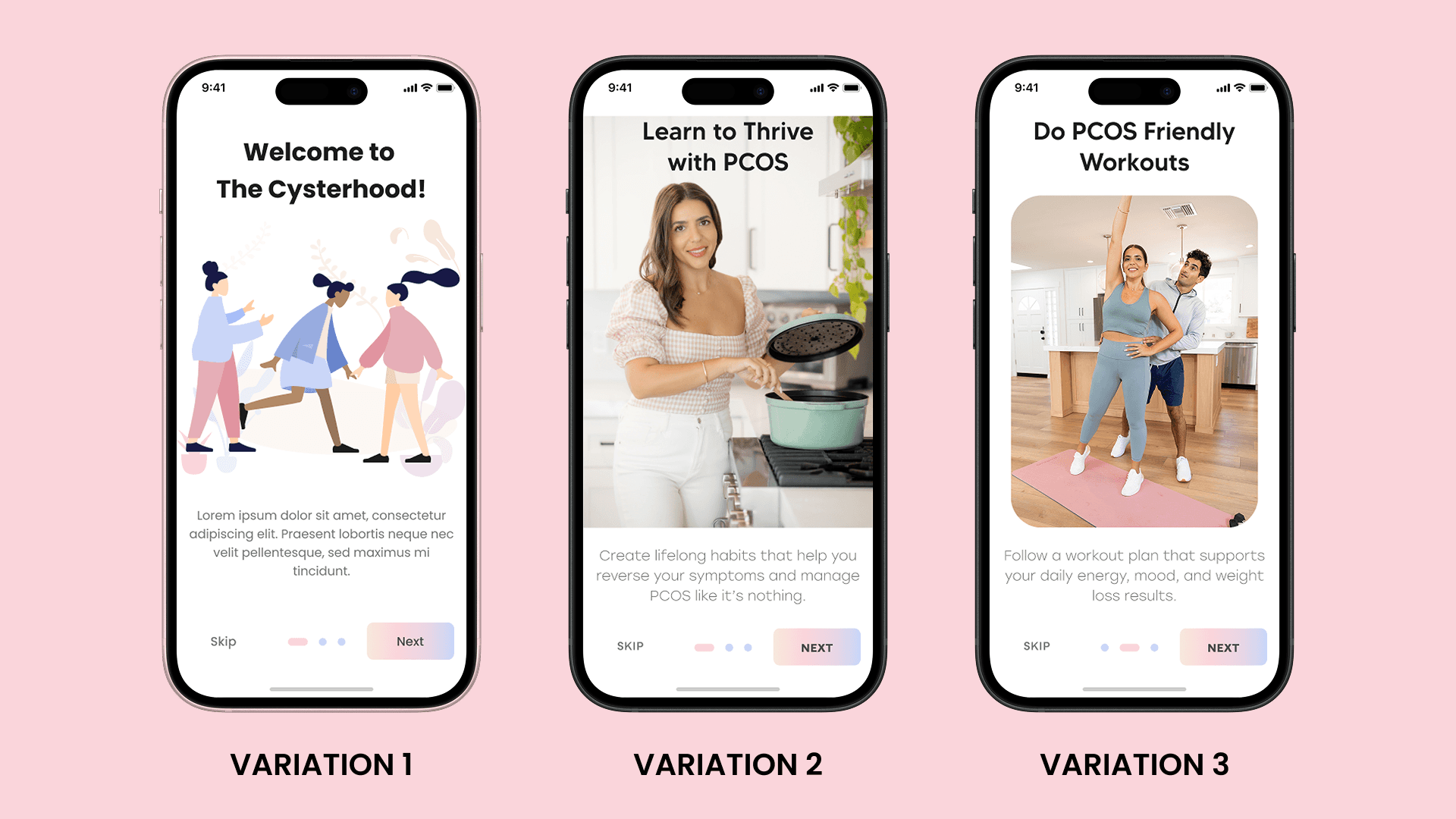
Three directions presented before full execution — the final visual language was assembled from client feedback across all three.
Onboarding
Two layers.
The intro sequence — three pre-app screens — established trust before anything functional. Each screen paired a value statement with founder photography directly. The tutorial used spotlight overlays, one concept per screen, matched to the cognitive load of someone navigating a health tool for the first time.
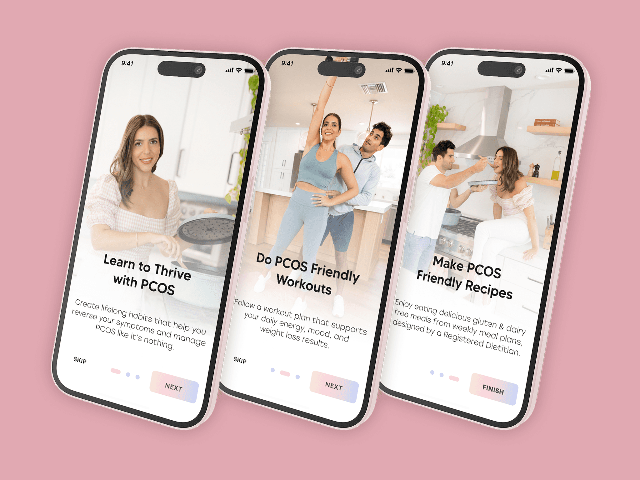
Founders' faces in the first three screens — a deliberate trust signal before the user reaches any functional content.
What I'd Do Differently
Build a design system, not just a colour brief. Consistency across five sections relied on manual discipline — fragile, and it would have broken with a second designer on the project.
Get involved before the wireframe handover. Some decisions relied on intuition rather than user insight. Light involvement in the research tail would have closed that gap.
Outcome
Launched on iOS and Android. 50,000+ downloads on Android alone. Visual foundation remains largely intact four years after launch — no fundamental redesign needed.


01


