Nightclub Platform
Designing across 3 connected surfaces for venues, consumers, and staff
00

problem
Ordering drinks in US nightclubs meant stopping everything, walking to a crowded bar, waiting in queue, and repeating the whole process every round. No table service, no visibility for bartenders, no operational control for owners.
solution
A three-surface ordering system - consumer app for ordering and tracking, bartender PWA for managing live queue, and admin portal for venue and menu management. One unified system closing the loop between all three user types.
Understanding an Unfamiliar Context
I'm Indian, I don't drink, and I had no frame of reference for how a US nightclub bar actually operates. Before any wireframe, I asked the client to walk me through the experience - not requirements, but what a customer physically does when they want a drink, and what a bartender sees during a rush.
That conversation reframed everything. The bar counter isn't just inconvenient - it's a physical bottleneck that degrades the experience for all three user types simultaneously. Once that was clear, the user flows followed naturally.
Three Surfaces, One System
Most products are designed for one user type. Paty had to work for three simultaneously, with state changes in one surface triggering immediate updates in the others.
Surface | User | Device | Core Function |
|---|---|---|---|
Web Admin Portal | Nightclub Owner/Manager | Desktop/Laptop | Manage locations, bars, menus, staff, hours, etc. |
Consumer App | Nightclub Customer | iOS + Android | Discover venues, order drinks, track status |
Bartender PWA | Bartender | Any handheld device, like a phone or tablet | Manage live order queue, mark orders ready/cancel, mark items out-of-stock |
.year
2023
.timeframe
2-3 months
.role
Solo UX Designer - research, IA, design system, and UI
.team
1 UX Designer (me), client stakeholders, BA, PM
.tools
Figma
.category
Multi-surface Design
Design System
Three surfaces. One design system. Built before any screen production — not aesthetic preference, but operational necessity.
Typography: Space Grotesk for display, DM Sans for body. Major second scale at 16px base.
Iconography: Material Symbols Rounded extended with custom venue and service icons.
Colour: 11-step neutral scale with semantic tokens for success, info, and alert states — ensuring consistent feedback behaviour across all three surfaces.
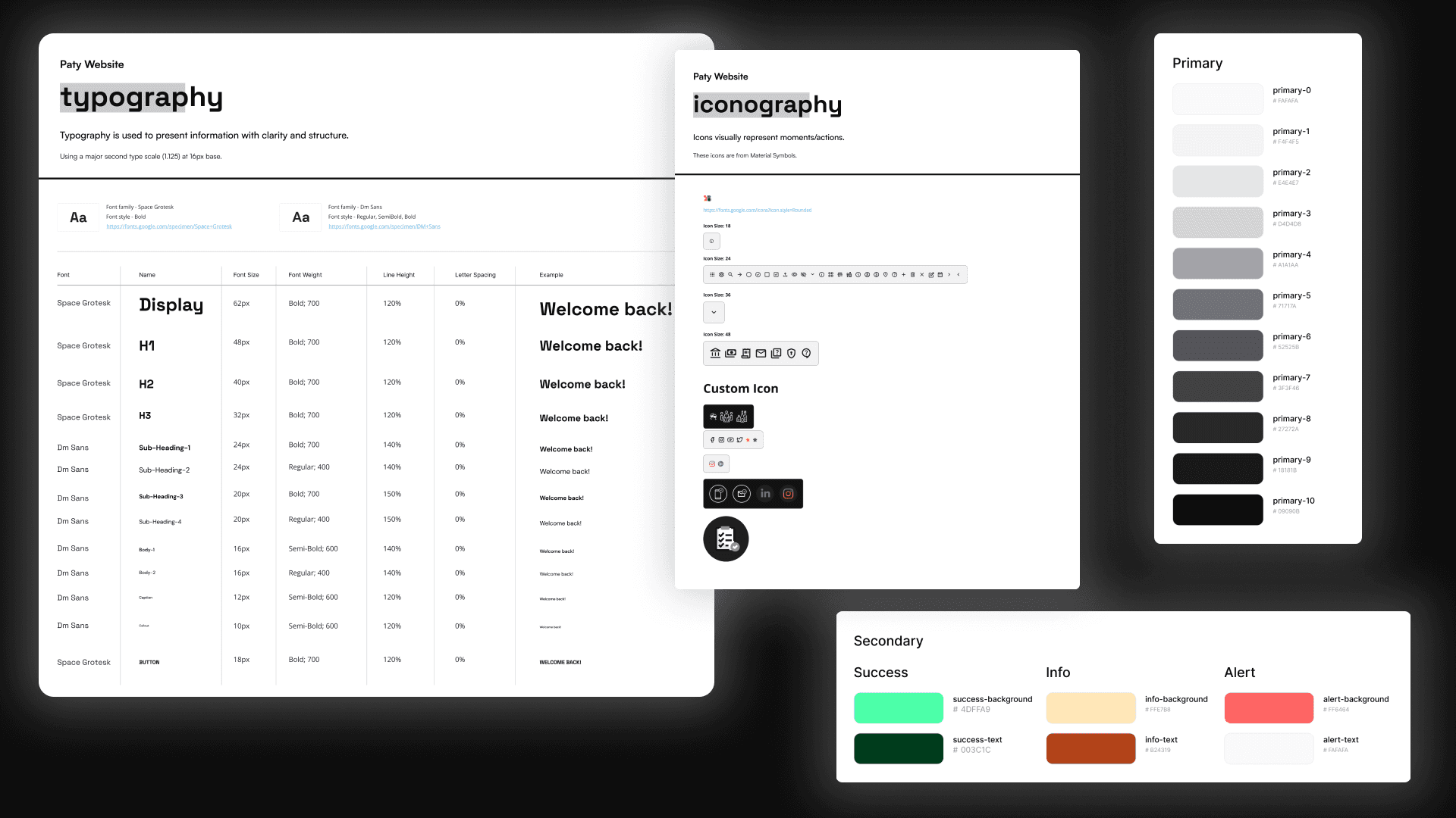
One design system built before any screen production — semantic tokens ensured consistent alert behaviour across all three surfaces.
The Admin Portal - Where the System Begins
The admin portal was designed first — every piece of data the other two surfaces consume originates here. The menu hierarchy runs five levels deep: Location → Bar → Category → Drink → Variants and Mixes.
Three decisions worth noting:
Per-group Pause/Live toggles — a manager can take one category offline mid-evening without touching anything else, with the change propagating immediately to the consumer app.
Mixes as a reusable library — configured once at the account level, applied per drink via a checkbox.
Preparation time at bar level — the manager sets prep time in minutes when configuring a bar; that number feeds directly into "Pickup in X mins" in the consumer app.
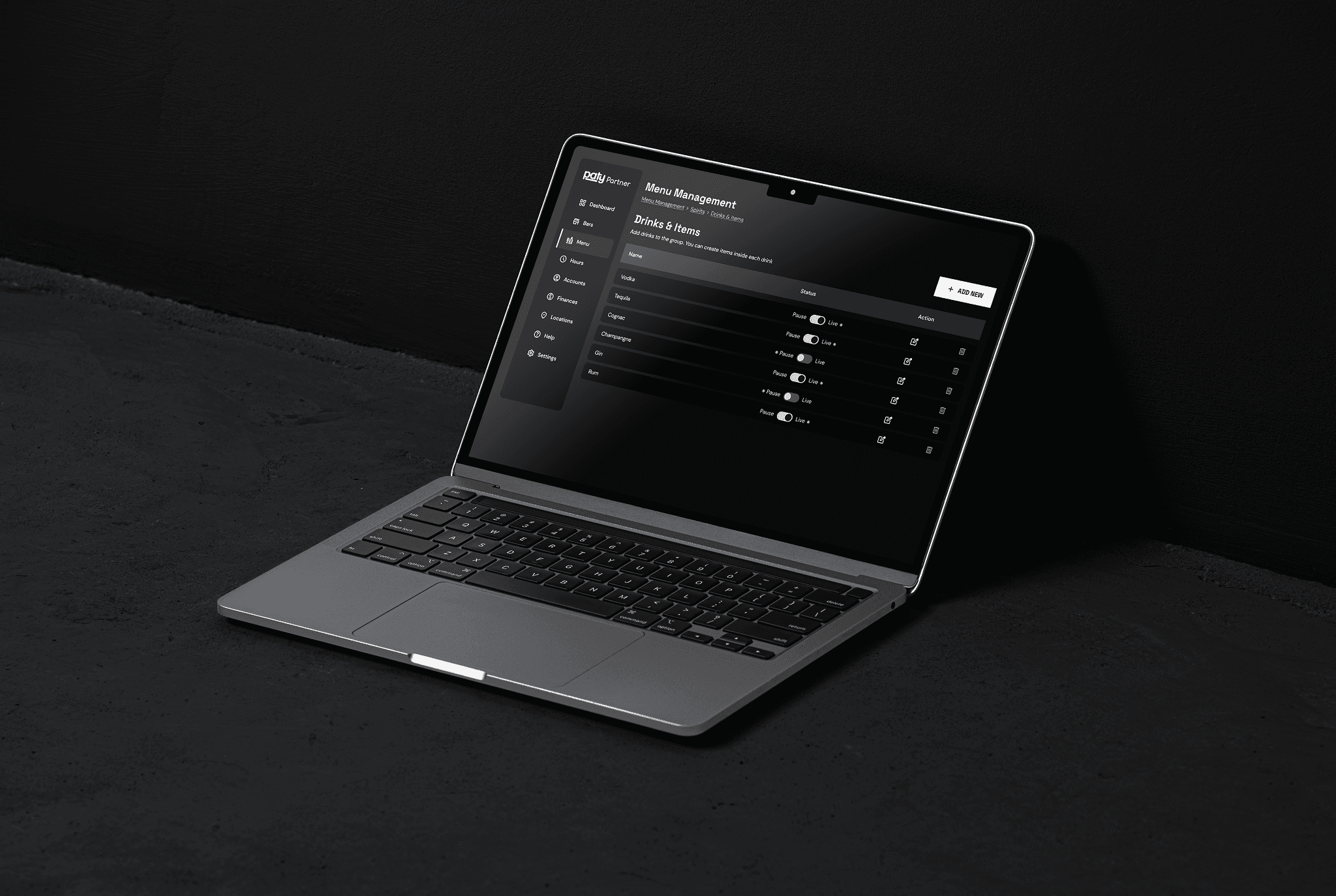
Five levels of hierarchy made navigable through breadcrumbs and progressive disclosure — every piece of data the other surfaces consume originates here.
The Bartender PWA - The Operational Core
The most operationally critical surface in the system. If it fails under real conditions, everything else fails with it.
The queue is chronological and intentionally flat — no priority tiers, no urgency flags. Adding priority logic would increase cognitive load and invite disputes. First in, first served. The Delay Order function matters for the same reason: a bartender falling behind can buy time without cancelling. The customer's countdown adjusts; the system accommodates a rush without breaking the experience on the other end.
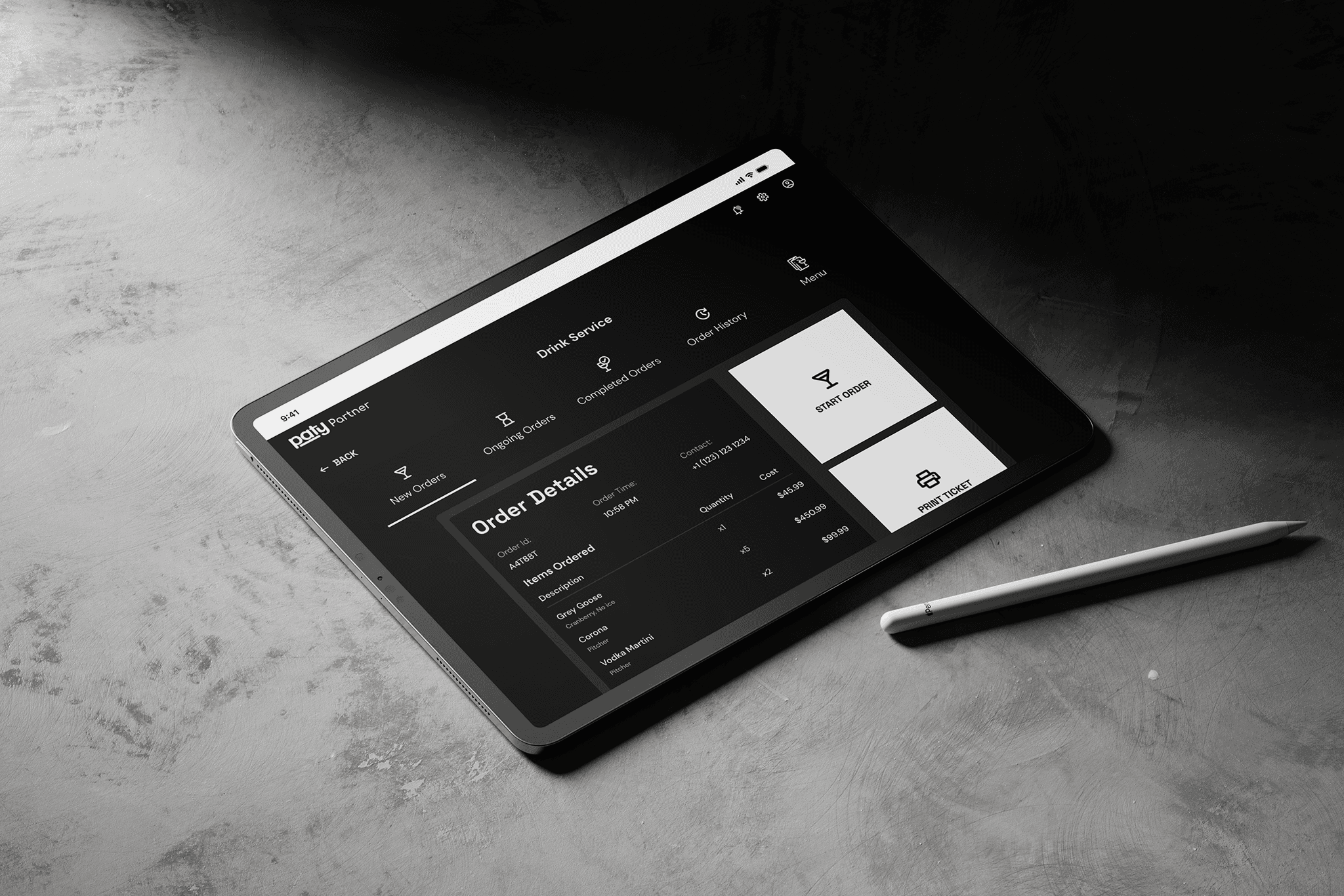
Chronological, intentionally flat queue — no priority tiers, operable under real service conditions with one hand.
The Consumer App - The Visible Product
The consumer app is what users see. It only works because of the two surfaces behind it.
Venue discovery is location-aware - real photography, ratings, and service tags are visible before tapping in. A venue showing "Opens at 04:00 PM" is already available for pre-orders.
The order status screen is where the system closes: "Pickup in 12 mins" tells the customer when to move; when the bartender marks the order ready, the status updates in real time. The item detail - 1x Grey Goose, Single Shot, Cranberry, No Ice - reflects exactly what was configured in the admin portal and confirmed in the PWA.
Same data. Three surfaces. One loop closed.
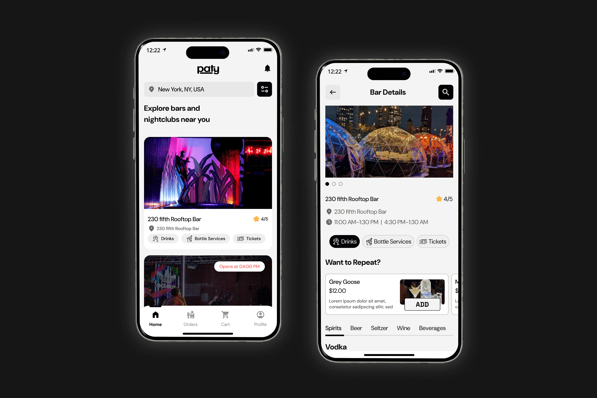
Location-aware discovery with pre-order support — a drink can be ready before the customer walks in.
What I'd Do Differently
Validate the bartender flow first. The PWA is the operational heart — but the consumer app was more visible, so it got more attention. I'd now treat the bartender flow as the primary design problem and get it in front of real bar staff before touching the consumer-facing states.
Structural validation before visual direction. Four to five rounds of visual iteration happened before the IA was validated. I got away with it, but it was a process risk. Wireframe testing with the client first would have been the right sequence.
Direct user access. All my understanding of US nightclub behaviour came through the client. A single observational session at a bar would have been worth more than any briefing.
Outcome
All three surfaces shipped and went live. The product launched across web and mobile. Admin portal successfully supported multi-location, multi-floor venue management. Client signed off without significant post-production revision.
01


